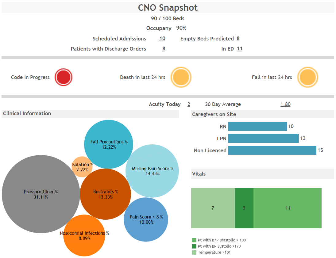
A common frustration among Chief Nursing Officers (CNOs) and other nursing leaders is not having the information they need at their fingertips to do their jobs. The data needed to stay adequately informed and be able to make good decisions is staggering. Often this data is simply not readily available. The information is in disparate software solutions that don’t talk to one another. In coaching nurse executives all over Middle Tennessee, I have seen firsthand and felt their frustrations. Often they receive reports that include old information in a format that is truly meaningless. You have to really study the report to see what is going on or it may be just one piece of the puzzle and you don’t have the entire picture. At least the report now comes via email so we’re not wasting as much paper on bad information. The good news is that nursing leaders no longer need to throw up their hands in despair or spend time clicking on different software links or web sites to have the information to do their jobs effectively.
The first step in changing the old process is to determine what you want to see on a visual that would give you meaningful information. Dashboards can then be created to display the information in a variety of helpful formats. Requirements gathering and dashboard creation is now a streamlined process that renders results in weeks rather than months. The process works best as an iterative approach where you can say, I want this, this, and this, with drill-downs into x, y, and z. Then when you see it, you can say… no, I want that instead. One other highly important, yet often overlooked item is data quality. We are hearing more and more about the need to take a step back from dashboards and audit the source data. That process is also best served in an iterative way where cycles are defined and reviewed, then continued. Data quality is highly important for making accurate decisions and good data in equals good data out.
I encourage my CNO friends to take a look at this sample we created to give you an idea of what can be done. Here’s my suggestion… curl up on one of these winter afternoons, get something warm and cozy to drink, and imagine what data you’d like to have at your fingertips. Sketch it out. Note what kind of drill-downs you’d like to see. Maybe you want a different tab for each nursing unit or each hospital you’re responsible for. Maybe you like graphs or charts. The sky is the limit. If you can dream it, very likely we can do it!
For more information on one of our dashboard tools, Tableau, check out the following blog post: “Quickly Change Measures Using Custom Controls in Tableau.”


